thankQ Help
When you are creating your Questionnaire you can select the following data types:
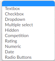
A description of what each Questionnaire Type does is explained below:
Textbox: Free text field, anything can be put in the answer field.
Checkbox: A single checkbox that will determine if the answer to this question is Checked or Not Checked. Note: This cannot be used for multiple choice answers.

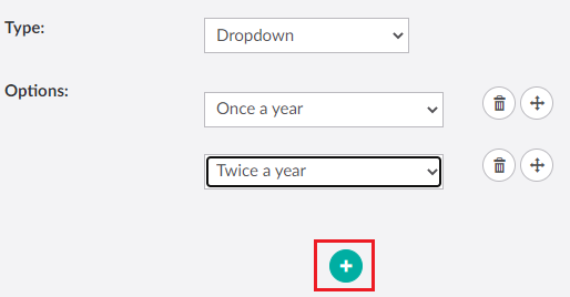
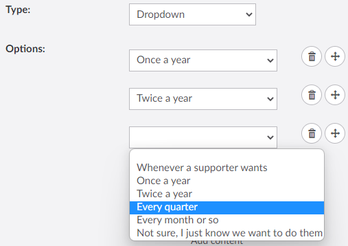
Dropdown: Allows user to select one answer from a list of possible answers. When selected options will appear that allow you to add the dropdown options they can choose from:
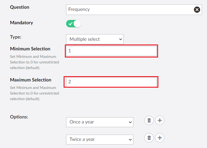
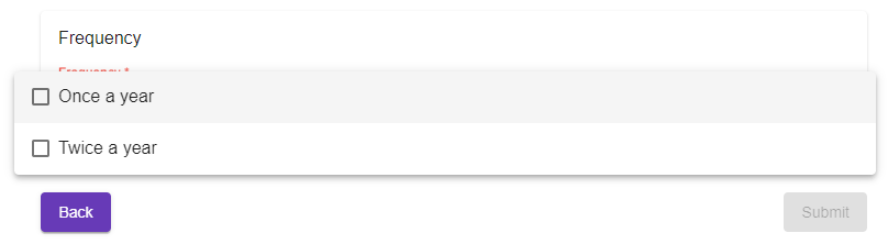
Multiple Select: Allows multiple choice answers, similar to the dropdown but it uses check boxes for each answer and you can determine the minimum or maximum number that must be selected by the user.
Hidden: Hides the question from the user. Here you can add an answer to a question in the background such as whether or not the user a visited a particular page (or any other reason you want). You must select one option in this mode.
Competition: Same as hidden but here you cannot select any options.
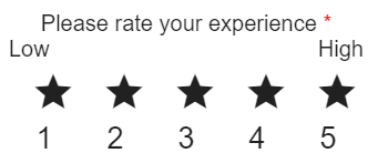
Rating: This allows the users to give their answer in the form of a rating. The following fields can be used:
Title: Displays the title of this rating question above the the rating icons.
Icon Size: Determines the size of the icons as displayed on the page. Required field.
Minimum/Maximum Rating: Determines the minimum or maximum rating that the icons correspond to (for example 1 to 5). Required fields.
Start/End Icon: Can select the icon pictures that will be displayed for the end user. Uses stars by default.
| Minimum/Maximum Description: What the user will see on the page that will correspond to the Minimum/Maximum rating (for example you could put 'Low' above the first icon, and 'High' above the last one). Note that Display Rating Description must be enabled for this to appear on the page. |
Display Number: Displays a number under each icon.
Display Rating Description: Required if you want the Minimum/Maximum Description to appear.
Enable Animation: Enables the icons to be animated, if this is supported.

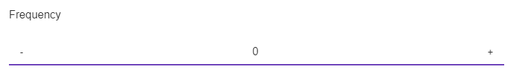
Numeric: This type is similar to free text, but only numbers can be put in the answer field.
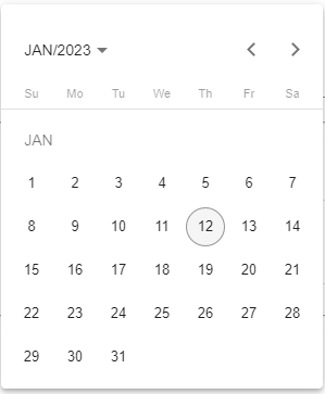
Date: Ensures that only a single date can be entered. User can select the date via a picklist.
Radio Buttons: Similar to dropdowns, however all options are displayed at the same time on the page as large buttons.