thankQ Help
The pivot report can also be compared to a three-dimensional chart in a general case. If you analyse car sales data, you will have car models on one axis, time on another axis and sales volume on the third. In terms of the XtraPivotGrid, you could have the car model field in the column area, purchase date field in the row area and the sales amount calculated for each column and row intersection.
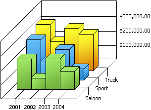
For example, take a look at the following 3D chart that shows the changes in sales over years for different car categories.
The XtraPivotGrid can display the same data in the following format.
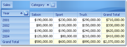
Each column and row intersection in the PivotGrid can contain more than one cell. For instance, in the example above you can show the number of cars sold in addition to the sales volume. To achieve such multi-summary layouts, simply place several fields in the data area.