thankQ Help
To see how the PivotGrid converts raw table data into a flexible report, imagine a car sales database with the following structure:
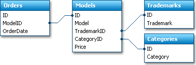
The main data we are interested in is contained in the Orders table. Each record in this table is a single-car purchase.
Data tables, like the Orders table in our example, are often referred to as Fact Tables. This is because such tables contain the facts that took place, and will be analysed. The remaining tables are simply needed to obtain human-readable information. In our example, they are needed to get the car model name or car category using the car id stored within the fact table. They wouldn't be needed if a user could identify cars by their IDs. These additional tables are usually called Dimension Tables.
To get human-readable information about car sales, we can merge data from all the tables into a single query. And this is how this data would look if displayed by the Data Grid or another grid control:
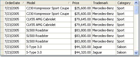
The number of records in such a query will match the number of records in the fact table. In our example, the number of records will match the number of car orders, and thus, the number of cars sold (since each record in the Orders table is a single-car purchase). If we need to analyse car sales over a long period, say several years, we can get numerous records which are almost impossible to analyse using traditional grid controls.
If you wish to see how sales have changed over time, you will most probably be interested in changes that took place from month to month or even from year to year. Another data analysis alternative is to see which car model has the most sales. In either case, you would like to compare summaries calculated against groups of related records. You can obtain such values even when using traditional grid controls, but with the PivotGrid less effort is needed, and the resulting reports are much more compact and easier to analyse.