thankQ Help
The following is an overview of the interface elements that assist in the process of creating and customising reports.
Allows you to quickly show or hide the Field List, Report Gallery, Report Explorer, and Group and Sort dock panels at design time.
Contains buttons for changing the font properties of the selected text-oriented control (XRBarCode, XRCheckBox, XRLabel, XRRichText, XRTableCell or XRZipCode), or the font properties of the text selected in the control's In-Place Editor (invoked by double-clicking the control).
You can also use this toolbar to zoom in or out of the Designer surface, as an alternative to the Zoom Panel located at the bottom right of the report tray.
Report Controls in the Toolbox
The Toolbox provides the controls that can be added to the currently opened report, by dragging and dropping them onto report bands.
Dock Panels
You can open or activate any of the following panels using the XtraReports Menu.
Allows for quick navigation through report elements and displays additional components assigned to a report, such as various data objects created when binding a report to a data source.
To edit component properties, select them in the Report Explorer and switch to the Properties window, or right-click them to invoke their context menu.
Lists the hierarchy of fields contained in tables and/or views of the report data source, and allows you to create custom data objects (report parameters and calculated fields).
To create a report control bound to a selected field, drag-and-drop this field onto a report band.
To select multiple data fields, press and hold the CTRL or SHIFT key. After you drag-and-drop multiple data fields on the report surface at once, an XRTable with its XRTableCell controls bound to these fields is created.
To create column headers (in a PageHeader or ReportHeader band), select the required fields in the Field List and drag-and-drop them onto a report's surface with the right mouse button.
Allows you to quickly evaluate and manage the grouping and sorting hierarchy of a report.
Report View Tabs
Allow you to quickly switch between design and preview modes, as well as evaluate scripts in a report.
•The Designer tab loads the Report Designer, which provides an editing surface for customising the report's layout.
•The Preview tab loads a print preview that displays a generated report document for evaluating its layout at design time.
•The HTML View tab shows a report document converted to HTML and published on a sample webpage.
•The Scripts tab opens the script editor where you can manage and validate report scripts.
Report Status Bar
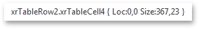
Displays the name of a selected report or its element, and provides information about its current location and size (for report controls) or paper kind (for a report).
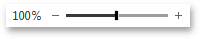
Report Zoom Panel
Allows you to change the current zoom factor value applied to a report's design surface.
Report Editing Surface
Smart Tags and Context Links (Verbs)
A report's smart tag is located at the left top of the Report Designer area. Click it to invoke the report's actions list that contains context links (verbs) corresponding to the most often used properties and actions.
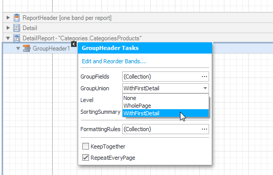
Most report elements (bands and controls) also provide smart tags to invoke context-sensitive action lists that provide properties and commands specific to the element's kind.
Rulers
The horizontal and vertical rulers display tickmarks in the measure units specified for your report. Click an element to evaluate its size and location using the rulers.
The horizontal ruler also allows you to modify a report's side margins (the XtraReport.Margins property value) by moving the left and right sliders on the ruler.
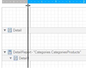
The vertical ruler shows resizing rectangles for every report band, which you can move to change the band height.
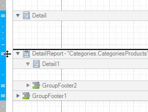
Band Headlines
In the Report Designer, each report band carries a headline, the title, icon and color, which depends on the band kind. These headlines are not printed in the resulting report document and are only visible during design time.
You can expand or collapse a band's content, by clicking the triangle at the left of the band's headline. To access the properties of a band, select the band by clicking its headline, and then switch to the Properties window or click the band's smart tag.
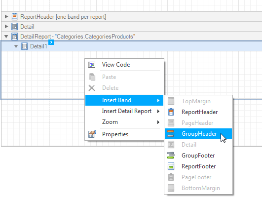
Context Menu
This menu provides quick access to the most commonly used actions that depend on the element for which it is invoked. For example, it allows you to arrange report elements (using the Bring To Front, Send To Back and Align To Grid actions), insert new bands, cut/copy/paste report controls, and switch to the code view of a report. To invoke this menu, right-click a report element or the report editing surface.