thankQ Help
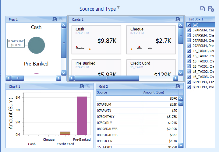
The Card dashboard item displays a series of cards. Each card illustrates the difference between two values. This difference can be expressed as an absolute value, an absolute variation or a percentage variation.
Video: https://www.youtube.com/watch?v=EYNdmtbUnhQ
Section |
Processed as |
Description |
Cards |
Measure (both Actual and Target values) |
Contains data items used to calculate values displayed within cards. Data items are arranged in containers. Each data item container can hold two data items. The first item contains actual data and the second item (optional) contains target data. If both items are provided, cards show the difference between actual and target values. You can fill several data item containers in the Cards section and use the Values drop-down menu to switch between the provided values. To invoke the Values menu, click the icon in the dashboard item caption or use its context menu. Note: This drop-down menu is available if the Series section is not empty. Otherwise, a separate card is created for each data item container, and all cards are displayed simultaneously. |
Series |
Dimension |
Contains data items whose values are used to label cards. |
Sparkline |
Dimension |
Provide a dimension whose data will be used to visualise values using sparklines. |
1.Drag Amount to Actual
2.Drag Source and Type to Series
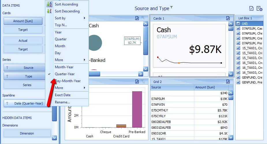
3.Drag Date to Sparkline
4.Click on the drop down beside Date under Sparkline and select Quarter-Year
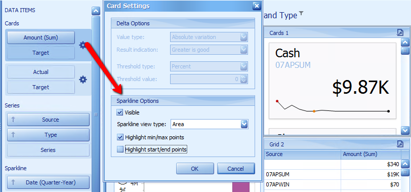
Click on the Cog option beside Amount
5.Select Area from the Sparkline view type
6.Untick Highlight start/end points, click OK
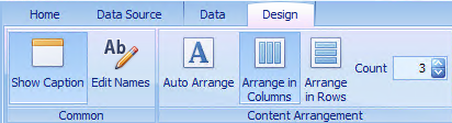
7.Click Arrange in Columns under the Design tab
8.Reposition Dashboard Items using the side handles