thankQ Help
Page layout is where you can enter various details regarding the layout of the page. A brief summary of these fields is provided below:
Workflow Navigation Labels
Next/Back/Submit Button Labels: Text labels to be used for the buttons that are listed as Next, Back or Submit by default on the page.
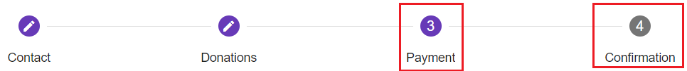
Confirmation and Payment: Labels to be used for the steppers to indicate if the contact is at the Payment or Confirmation stage of the transaction. The labels which are changed are shown below:
Page Title: Title of the page in the browser. This is the equivalent of setting the <Title> tag in HTML. By default the pages do not have a title.
Page Width: Width of the overall page, normally set to 800px.
Hide steps if the screen is smaller than: The page is automatically designed to get rid of the stepper if the browser's width goes below a certain amount (600px by default). This feature will change the threshold at which it will hide. If you want the stepper to always be hidden change this amount to a very large number (such as 5,000).
Form Width: This changes the width of the form objects (everything on the page below the stepper and above the Next/Back/Submit buttons). Normally this is set to be the same as the page width (800px).
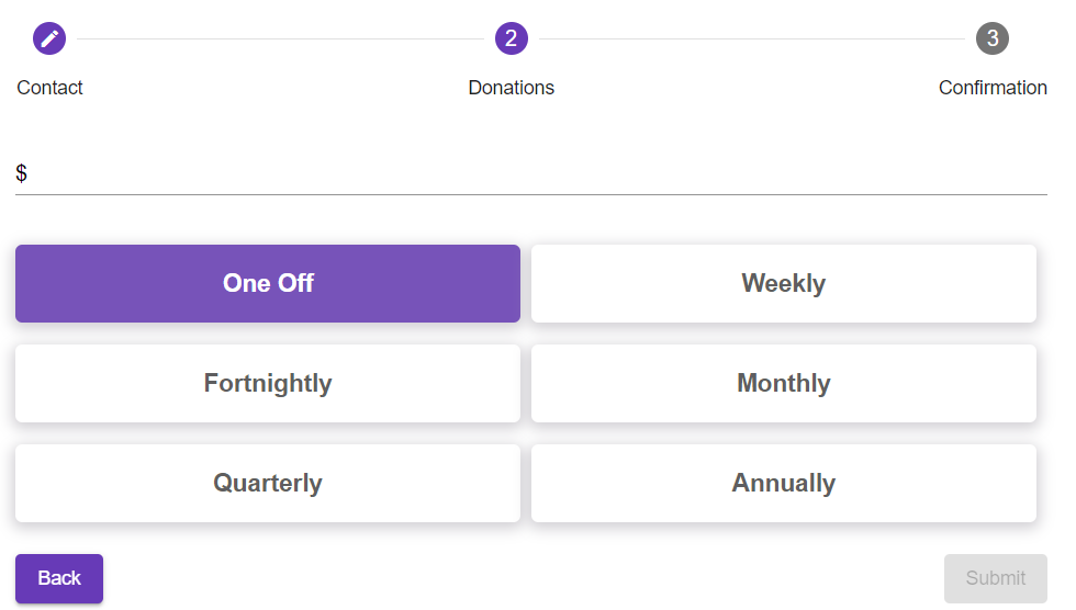
Max number of ratio buttons per row: Changes the number of form buttons that can be displayed before forming a new row (default is 3). For example if this is set to 2 then a 6 button setup will contain 3 rows as shown in the example below:
Event Listing Components and Event Card Components
These aspects of the page apply only to pages which have Event Components in them. A detailed explanation of Event Components will therefore be provided in Event Components in Page Layout.
Page Loader Options
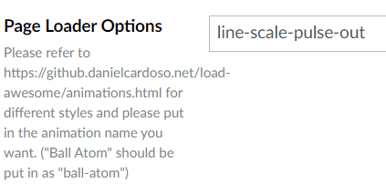
When the page is initially loaded by the user an animated load icon will be displayed. You can change this if you want. By default the ball-atom animation is used.
A full list of animations to choose from can be found here:
https://github.danielcardoso.net/load-awesome/animations.html